Create a graph using ingested or computed datasets. All information for graphs is accessed from datasets associated with sites. This can be data ingested directly from a site, or a computed dataset created from the ingested data.
To create a graph, you must select the site and dataset(s) from which to populate the graph and define display properties for the graph and the datasets within it. This procedure is explained in the sections below.
If you attempt to navigate away from the page without saving changes, a message will be displayed to confirm that you want to leave the page without saving. If you click Yes, any unsaved changes will be lost; in the case of a new graph, the graph will not be created.
Site Selection
A graph displays data from one or more ingested or computed datasets. The first step in creating a graph is to select the sites to include.
1. [Optional] Select a site group from the Select a group list. This will filter the sites list to only those sites in the selected group.
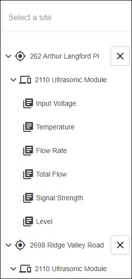
2. Select a site from the Select a site list.
All datasets associated with the site are displayed below the site list. If the graph requires datasets from more than one site, additional sites can be selected from the site list. Each time a site is selected, the list of available datasets is added below the site list.
3. Click a site name in the dataset list to view the available datasets.
4. Click a dataset to add it to the graph.
The graph preview will be populated with data from the selected dataset and the name of the dataset will be added to the legend at the top of the graph. The color of the data in the graph is determined by the Data Types settings in the Preferences tab of the user’s profile page. See User Profile for information on the Data Types settings. Moving the mouse cursor around the graph preview will display a tooltip populated with the point values for each dataset at the current cursor location.
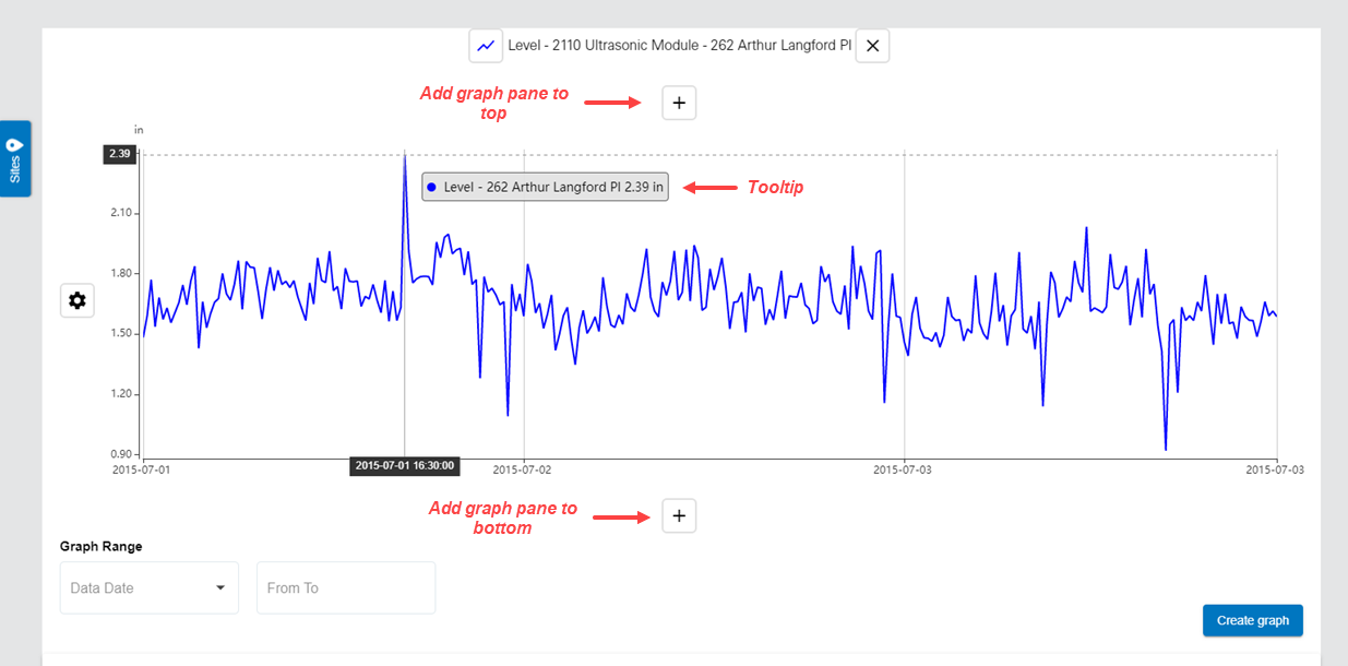
Additional panes can be added to the graph using the Add graph pane to top and Add graph pane to bottom buttons. Additional panes can also be added to the graph by clicking another dataset in the dataset list. If the graph contains empty panes, clicking a dataset will automatically add it to the first empty pane in the graph.
5. To add a dataset to a different pane, click and drag the dataset from the list into the appropriate pane. If all panes contain a dataset, click a dataset in the dataset list to create a new pane with the dataset.
6. Datasets can be removed from the graph by clicking the  button at the end of the dataset name in the legend.
When site selection is complete, the sites list can be collapsed to provide a larger window for working with the graph settings.
7. Click the Sites button  to collapse the sites list.
The Graph Range options can be used to define the scope of the graph. The scope can be either a set number of hours or a date range. These are optional settings. If the scope is not defined, all data within date extents of the dataset are displayed.
• Data Date: This option defines a set number of hours or days for which data will be displayed in relation to the current date and time. The options include the past 24 hours, 48 hours or 7 days. When the graph is viewed at any time, the application will reference the current date and update the graph display accordingly.
• From To: This option defines a specific start and end date for the data. Only data that was recorded within these dates will be displayed in the graph.
8. Select an option from the Data Date drop-down list.
9. Click the From To field to display the calendar tool.
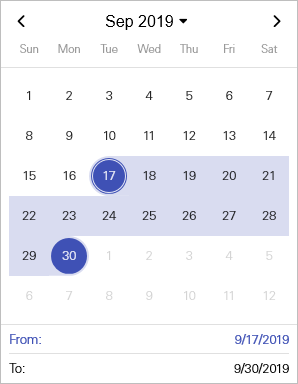
10. Click the start date for the date range, which will populate the From field at the bottom of the calendar.
11. Click the end date for the date range.
The calendar tool is closed and the field will be populated with the selected date range.
Dataset Properties
Once datasets have been selected for the graph, the display properties can be defined for each dataset in the graph.
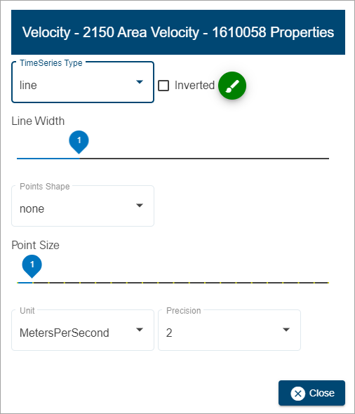
1. Click a dataset name in the graph legend.
The dataset properties dialog box is displayed.
Property | Description |
|---|---|
Time Series Type | The graph format to be used when configuring a time series graph. The data can be displayed as a single line or as filled bars. This setting is only applicable if creating a time series graph; it has no affect on scatter plot graphs. |
Inverted | Invert the Y-axis of the dataset. Data values will increase from top to bottom in the graph instead of the default bottom to top. |
Color
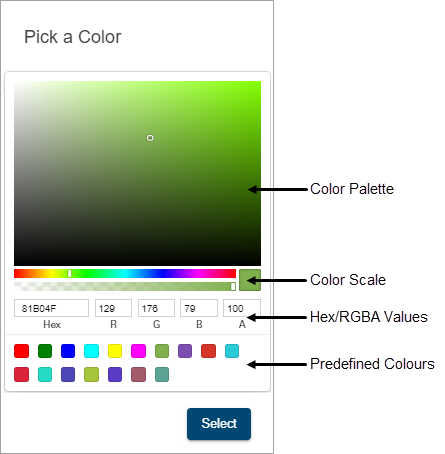
| The colour used to display the dataset in the graph. This is defined by the Data Types settings in the Preferences tab of the user’s profile page, but can be changed if the default color is not appropriate. 1. Click the color selector button to launch the color picker tool.
Several methods are available for selecting a color: • Color palette: Move the color slider along the color scale bar to select a general colour family and then click in the color palette to select a specific color. • Hexidecimal values: Enter the hexidecimal number of the desired color in the Hex field. • RGBA values: Enter the RGBA (red, green, blue, alpha) values of the desired color in the appropriate fields. • Predefined colours: Click one of the predefined color blocks to select that color. 2. Select a color using the various tools available in the color picker. 3. Click Select. |
Line Width | The width of the line representing data in a time series graph, measured in pixels. 1. Click and drag the control to the desired width. |
Points Shape | The shape to use to display points in a dataset in a graph. 1. Select a shape from the drop-down list. |
Point Size | The size of the data points in a graph, measured in pixels. This setting is only applicable if the Points Shape property is set to something other than None. 1. Click and drag the control to the desired size. |
Units | The unit of measure and number of decimal places to use for the data in a graph. 1. Select an option from the Unit drop-down list. 2. Select the number of decimal places from the Precision drop-down list. |
2. Change the property settings as needed.
3. Click Close.
4. Repeat for other datasets in the graph as needed.
The graph display will be updated to reflect the selected property settings.
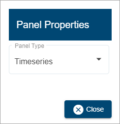
Panel Properties
Two graph types are available for displaying data. The graph type is controlled by the Panel Properties, which is accessible from the Graph pane settings button  at the left of each pane in the graph.
• Time Series: data is presented along an X-axis that represents time. A separate data line is displayed for each dataset represented in the graph.
• Scatter Plot: data is presented in a non-linear collection of points that show a relationship between two sets of data. One dataset is plotted on the X-axis; the other on the Y-axis. There must be two datasets in the pane to use this graph type.
To select the graph type:
1. Click the Graph pane settings button.
2. Select a type from the Panel Type drop-down list.
3. Click Close.
The graph preview will be updated with the selection.
General Details
The General Details options are used to specify an identifier for the graph.
The Title of the graph must be unique within the Flowlink Cipher database. By default, the Title will be the name of the first site selected for the graph. To reduce the number of steps a user must make to quickly create a new graph, and to ensure the Title of the graph will be unique, if the default Title already exists in the database, then an extension will be automatically added with a timestamp pattern YYYYMMDDhhmmss.
The Subtitle field is populated with "Flowlink Cipher" by default, but it is recommended that it be changed to something that indicates the purpose of the graph and the data it reports.
1. Type a name for the graph in the Title field.
2. Type an informative label in the Subtitle field.
The Make graph public option can be enabled to allow other users to view the graph. This will add the graph to the Public Graphs list on the Graphs view of the Analysis page. Users will be able to view the graph, but will not be able to edit it.
3. Enable Make graph public if the graph should be visible to other users.
The Template option can be enabled to save the graph settings as a template for future graph creation. This will add an entry to the My Templates list under the Templates view of the Analysis page.
4. Enable Save as Template.
Additional fields will be added. To make the template available to other users, enable the Public Template option. This will add an entry to the Public Templates list of the Templates view.
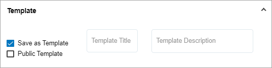
5. Type a Template Title and Template Description in the appropriate fields.
6. Click Create Graph to create and save the graph.