The vertical scale is inverted and the graph line redrawn. 
Current View settings include vertical axis options and controls for how the data is displayed in a graph.
These options apply to the currently active sensor window, or to the active data type.
Scale
Scale can be set to Fixed or Overplotted. Overplotted is the default setting.
• Fixed: the scale uses the Max-Min values based on values of data from the sensors displayed in the graph window
• Overplotted: the scale is based on the Max-Min values of the active data type.
To change the scale setting to Fixed:
1. Click in the sensor window containing the data to be examined.
2. Select Fixed from the Scale list.
Vertical Axis
By default, the data scale is shown on the Y-axis (vertical axis). The scale of the axis can be based on the minimum and maximum values of data in the entire line, or the minimum and maximum values of the data currently in view, or a user-defined axis.
To set the scale for the Y-axis:
1. Select a sensor window.
2. Select from one of three scaling options:
• Select Max-Min of Line to scale data according to the minimum and maximum data values of the entire line.
• Select Max-Min of View to scale data according the minimum and maximum values currently in view in the sensor window.
• Select User-defined Max-Min to define maximum and minimum scale and type the values in the maximum and minimum fields.
Show Data
Enabling the Data check box activates the Invert and Draw bars options.
The Invert option displays the data in a “mirror-image” view in the active sensor window. This function is useful for viewing towfish depth in the water column,
To invert the data in the graph:
3. Select the Invert option.
The vertical scale is inverted and the graph line redrawn.
The Draw Bars function displays vertical bars under the graph line. This option makes it easier to see time gaps between sensor values. If multiple data types are displayed in one graph, the vertical bars are drawn only for the active data type.
To view the graph with vertical bars:
4. Select the sensor type in the Layers window.
5. Select the Draw bars check box. 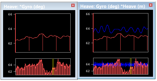
In the image above, the image on the left shows bars drawn for Gyro data, the active sensor data displayed in the Heave window (as indicated by the asterisk). The image on the right shows Heave data in blue.
The following options draw lines for various comparisons to the original data graph line.
• Filter/Smooth Line graphs the computed values derived from the adjacent data points and displays this line in the graph. This option applies the parameters set in the Data options.
• Difference graphs a line showing the difference between the original data values and the moving average or FFT value for each data point.
• Threshold option displays horizontal lines in the graph indicating the difference values that are clipped during smoothing. Threshold is a multiple of the standard deviation (sigma).
• The upper threshold signal is determined by the following formula:
original mean value + (threshold value X the standard deviation)
• The lower threshold signal is determined by the following formula:
original mean value - (threshold value X the
standard deviation
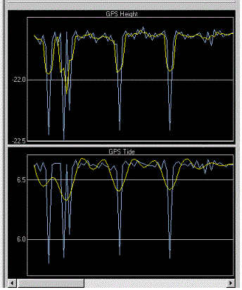
In this example, GPS height and tide, are graphed. The blue line represents the original data and the yellow line represents the smoothed data.