The TPU Analysis window enables you to visualize the proportional effect of the various error sources that make up the TPU. These component sources are displayed in pie chart, bar chart or scatter plot graphs.
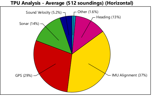
The TPU Analysis window example below displays a pie chart with the proportionate contributions of six error sources to horizontal TPU, as averaged over 512 selected soundings.
The options for the TPU Analysis window enable you to view:
• component sources as contributions to horizontal or vertical TPU
• sources as a percentage of the total contributions, or as component values
As well, the various error sources can be toggled on or off to see their impact.
This information can be exported to a comma separated value text file, or to a TIFF, BMP, PNG or JPG image.
To view TPU analysis for data:
1. Open the data to which TPU has been applied.
2. Open the TPU Analysis window.
Menu | Window > TPU Analysis |
3. Open Swath Editor, or load a subset of data in Subset Editor.
4. In an editor window, make a selection of data to which TPU has been applied, for example, in the Plan view in Swath Editor.
The TPU window will display a chart of the type last viewed. The default type is a pie chart.
To change the type of graph:
1. Right-click in the TPU Analysis window and select the type.
To change the data that is displayed in the graph:
1. Right-click in the TPU Analysis window and select or de-select the data to display.
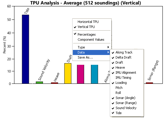
The example below shows selected sources contributing to vertical TPU.