Overview of multiple lines
The line data is displayed in the graph, coloured using the settings for the sensors. The Overview graph shows a down-sampled graph of all of the lines as illustrated below.
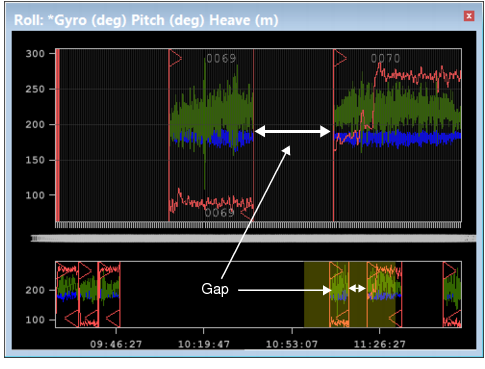
Disparities in time are displayed as gaps in the graph lines.
Lines that are selected in the Display window when the Attitude Editor is active, will be coloured with the Selection colour set in Tools > Options > Display > Sensor Editors. See “Sensor Editors” on page 646 to change this selection colour.